
Portfolio
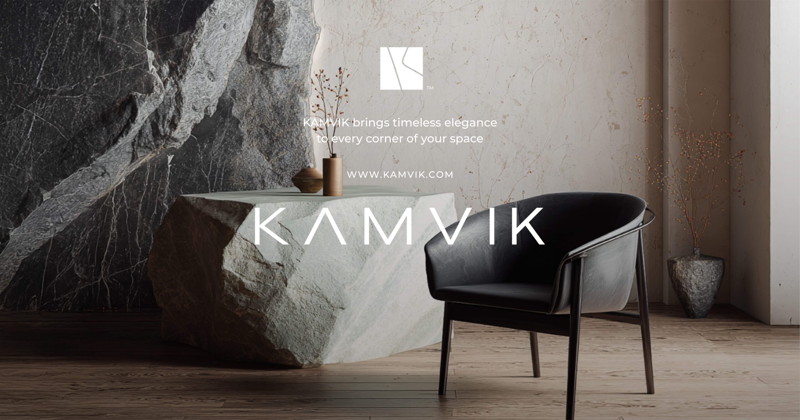
Kamvik brand identity
Project snapshot
Location: Vienna, Austria
Category: Brand identity
My role: Client acquisition, project lead, creative direction, approvals, presentation
Execution: Identity design and mockups by my design team under my direction
The story
Kamvik operates in a category where buyers decide fast.
If the brand feels unclear, they move on.
The goal was simple: make quality feel obvious at first glance.
What I led
Won the client and defined scope
Ran briefing and direction
Managed communication, timelines, and payment
Led brainstorming and concept selection
Approved outputs and presented the final system
Logo direction
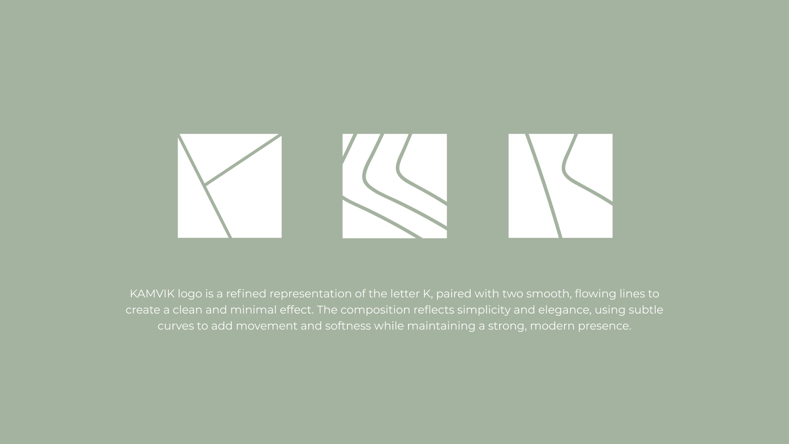
We built the mark from the letter K.
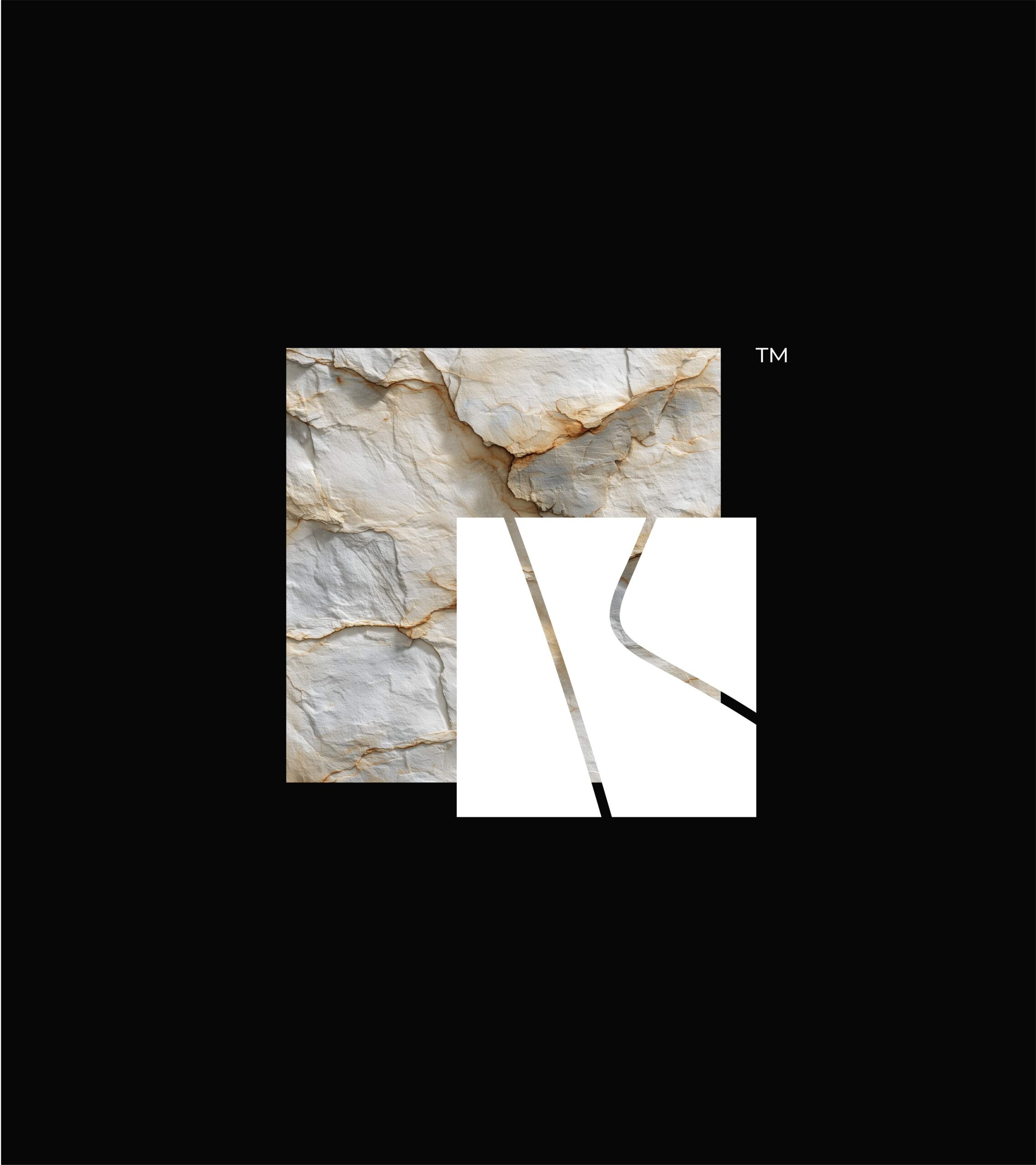
The lines hint at material movement without turning the logo into an illustration.
The system stays quiet so the product visuals can lead.

Outcome
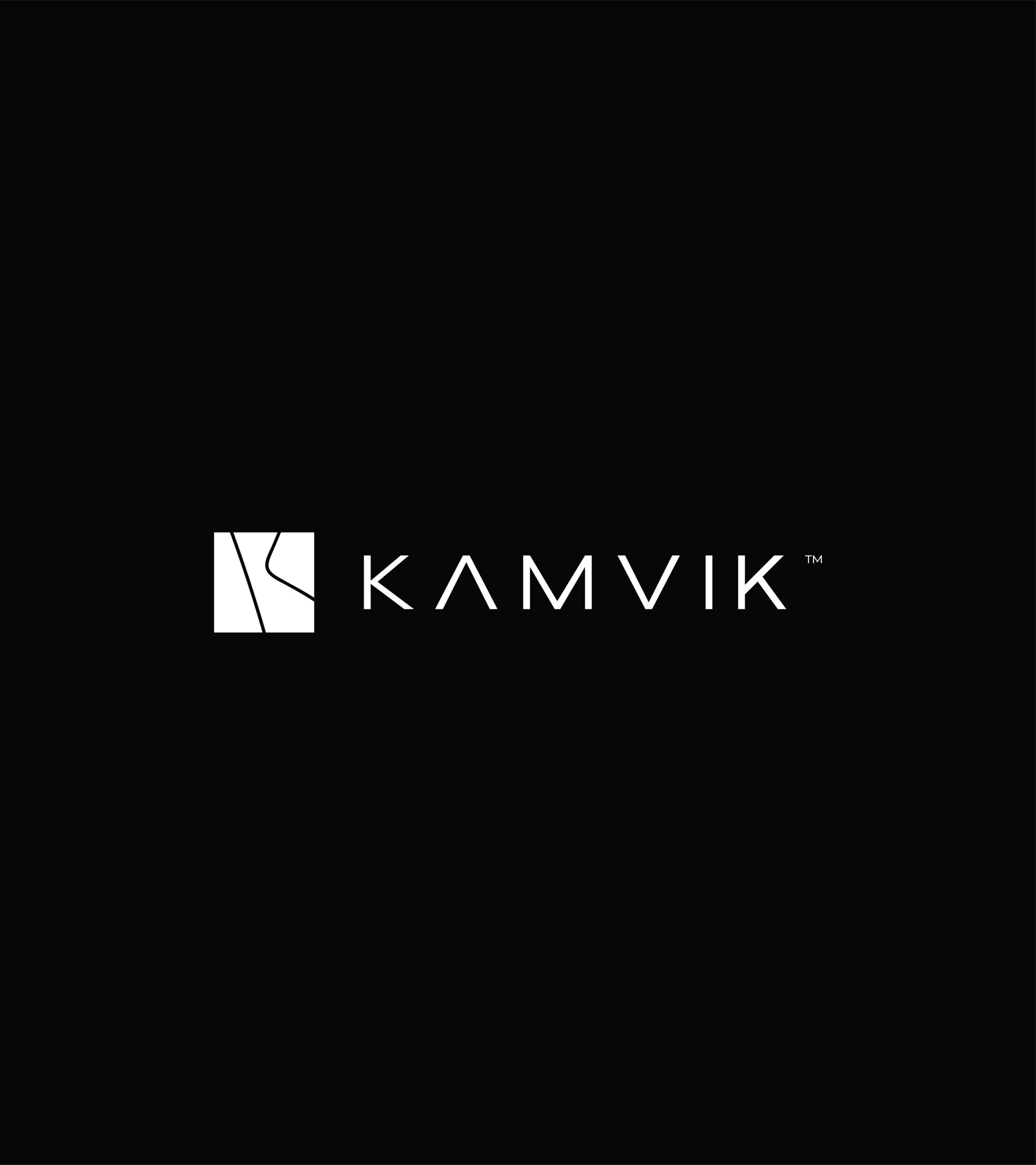
A clean identity system that supports a premium category.
Clearer first impression. More consistency across touchpoints.