Portfolio
Kidsmasta (Austria)
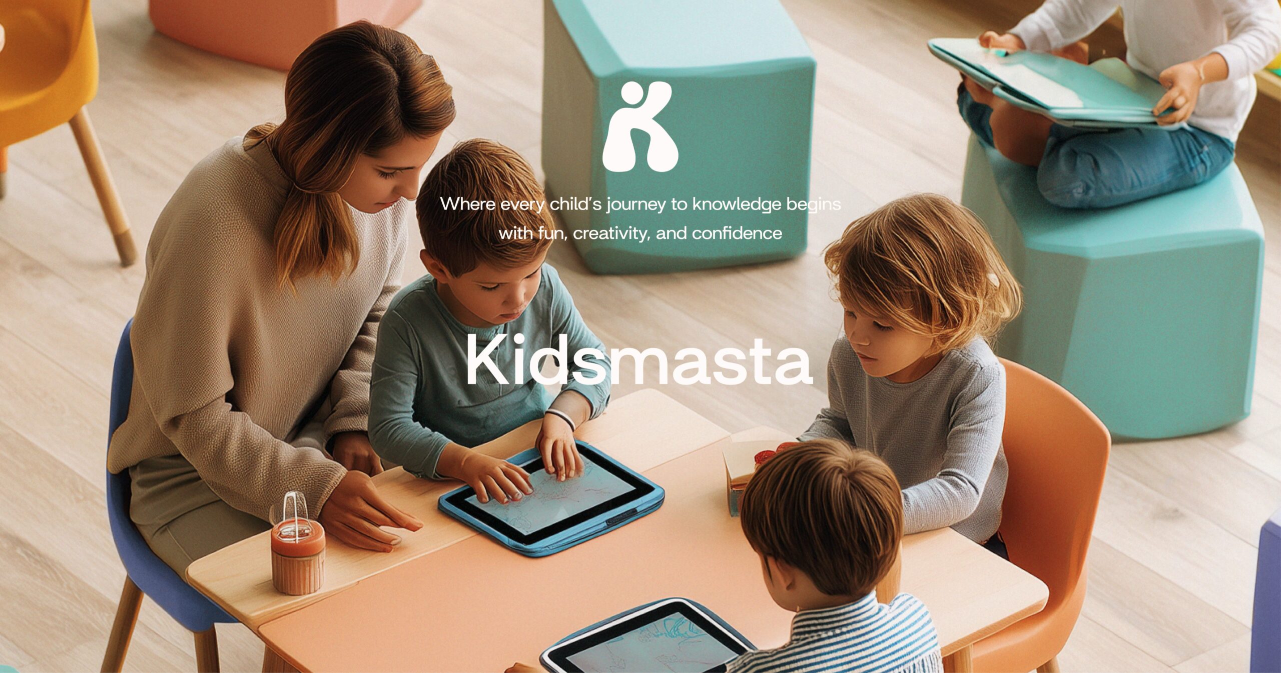
Kidsmasta is a kids learning app concept built around one simple hook:
kids choose a superhero guide to learn a skill online with more focus, fun, and confidence.
Project snapshot
Location: Austria
Category: EdTech app branding and UI/UX design direction
Timeline: 3 weeks
Process: 3 concept routes, 1 final winner
My role: client management, UX planning, creative direction, brainstorming with the designer, approvals and delivery
The brief
The client wanted a kids education app that feels:
Fun for kids
Trusted by parents
Clear on mobile
Easy to recognise in the app store
The system had to stay readable in small formats and look consistent across app screens, app icon, and marketing visuals.
Concept development
We built three routes to test:
tone and personality
color and energy level
interface clarity for kids
parent trust signals
We selected the winning route based on fast comprehension, icon recognition, and how easily the system could scale into more screens and content.
UX planning
I planned the UX to support short attention spans.
That meant:
fewer decisions per screen
clear action hierarchy
simple navigation patterns
strong visual cues
The goal was to keep kids moving forward without confusion, and keep parents confident about what the app does.
Visual identity
The brand mark was designed to feel friendly and modern.
The palette supports play, but stays controlled so the product still feels structured.
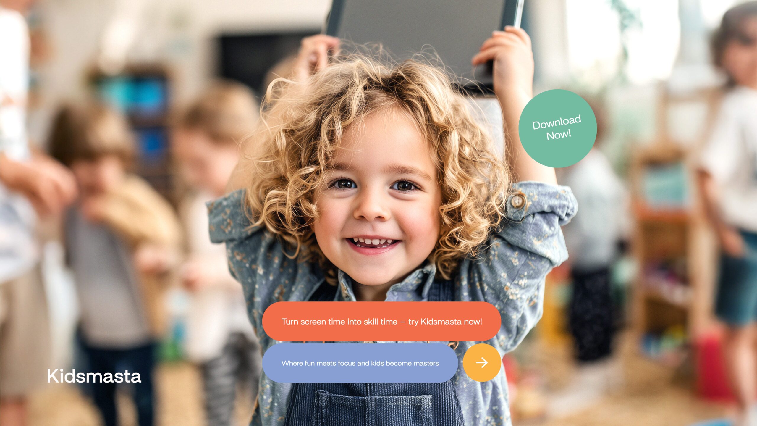
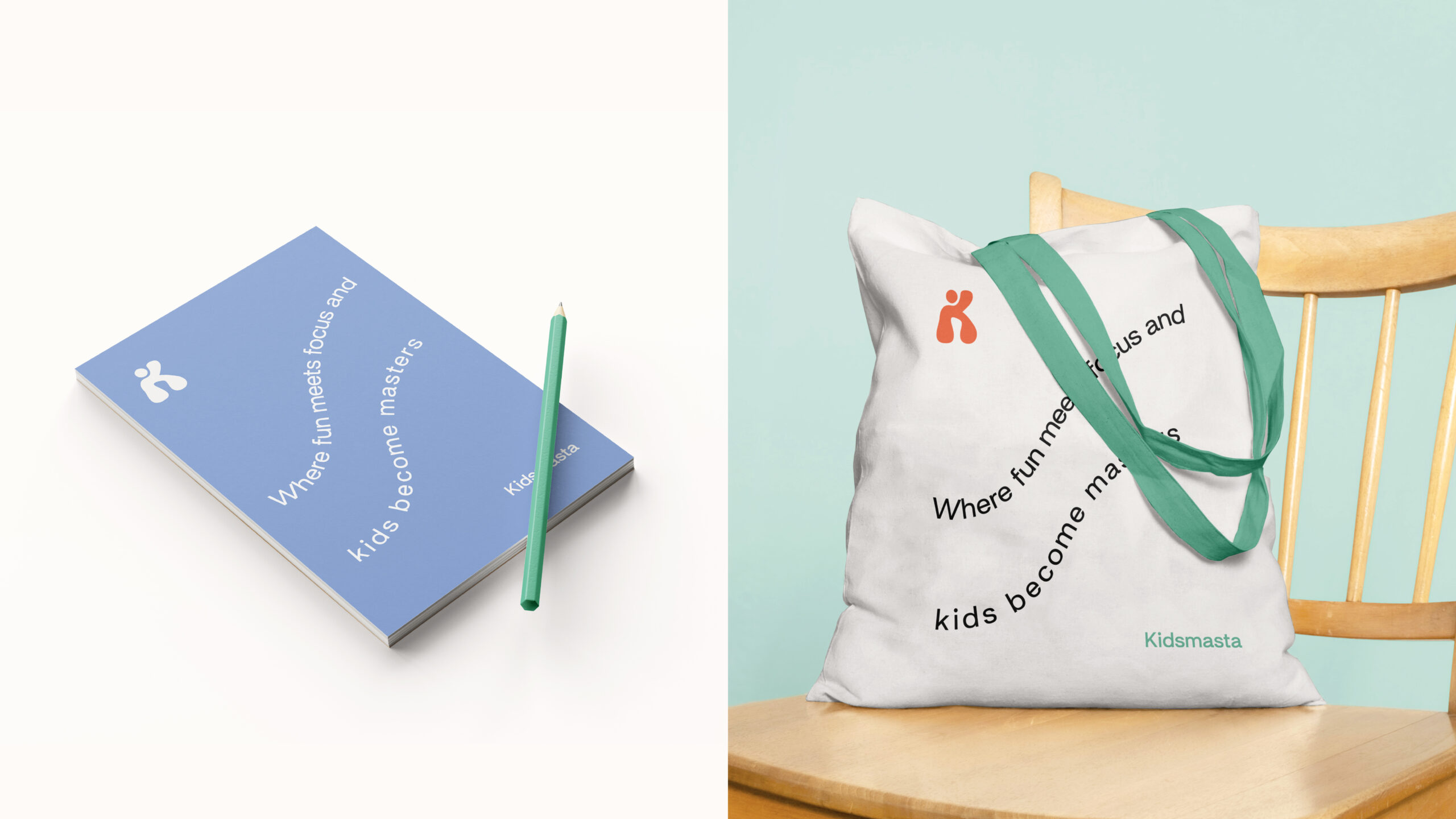
Outcome
Kidsmasta was delivered with a consistent system across:
brand identity
app icon
core UI direction
marketing-ready visuals
The final concept gave the client a clear base to expand features, screens, and future content without redesigning from zero.